NITISH TANDON
DIGITAL GRAPHIC DESIGN
NITISH TANDON
DIGITAL GRAPHIC DESIGN

Click on an image for a larger view!
This informational report was made in InDesign with text imported from Microsoft Word. I also included two pie charts that were created and designed in Illustrator and then imported into InDesign. The report was made in order to analyze the latest android smartphone technology.
Barefoot Jewels is a non-profit charity part of Nike that aims to provide homeless children with shoes and clothing. I was asked to make a logo for the company as well as a social media page. There may be a website coming up as well in the near future.
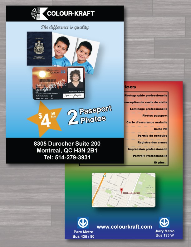
This advertising flyer was part of many documents designed for the company. This flyer was designed in Illustrator and the images were edited in Photoshop. The website for ColourKraft has been revamped as well as part of the project for the owner.
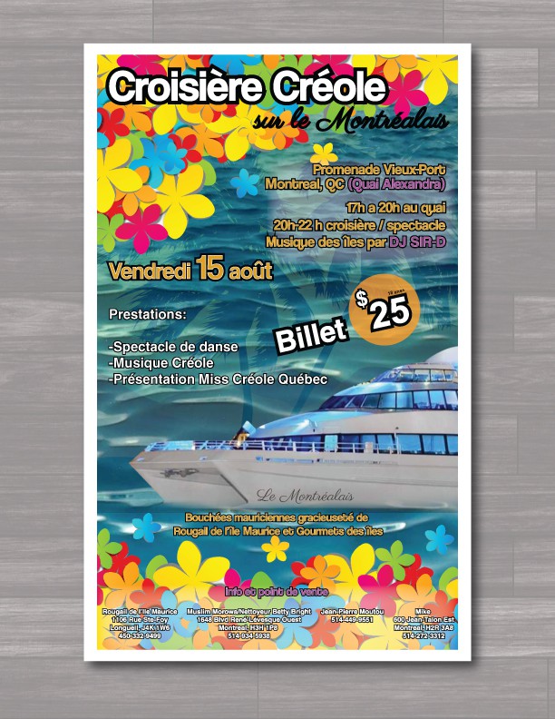
This flyer was deisgned for a Mauritian Cruise in Montreal. Photoshop played a small part in image manipulation but the majority of the flyer was desgined in Illustrator. The flyer was for advertising purposes to promote the event with festivities, presentations, performances and food from Mauritius.
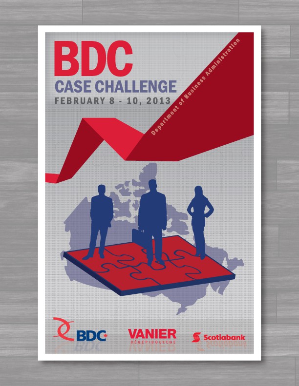
This poster was made for the BDC Case Challenge which gathers more than 25 colleges in Canada for a case study competition. The graphics were all created in Illustrator and then imported to InDesign in which the text was formatted.
I created this small pamphlet in order to highlight the work of Dan Cassaro. I did some research on his lifestyle and personality and incorporated that into the typeface selection and graphic implementation as well.
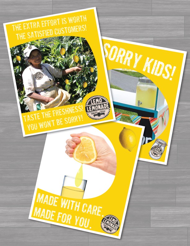
These posters were made for LemoLemonade in order to promote their product. The posters have a modern appeal and use light colours with an intended white outline to lead in the eye to concentrate on the content within.
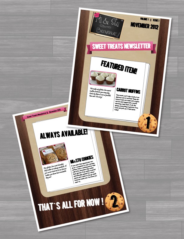
This small double-sided newsletter was made to highlight "Mi&Stu" baked goods. I chose colours that best represented the company and created the newsletter with a similar look to their website. This newsletter was then made online with mailchimp as well.
These pictograms were created in Illustrator for a community center opening up locally in Saint-Laurent. The pictograms were to represent common services that they would be offering and that would be easily understood.
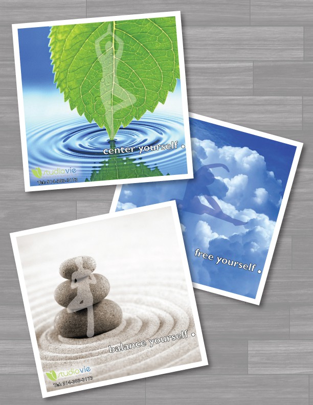
These designs were part of an advertising campaign made for Studio Vie. I created light silhouettes of yoga poses and embedded them into images representing nature. I also included the following taglines: center yourself, free yourself and balance yourself.
These posters were made for a competition for a Quebec agency that wanted to target teenagers and young adults in order to reduce the use of single occupant vehicles. All graphics were made in Illustrator for this piece and each poster was accompanied with a 100-word text to appeal to the targeted group.
 Home
Home About
About Print Gallery
 Web Gallery
 E-Mail